Designing a list view for different user needs
Moving from a cluttered 'show everything' grid to a focused, role-specific viewing experience.
I was designing the main list view for incoming applications, a critical screen for the team's daily workflow handling hundreds of new cases. The list had a major usability problem: it was accessed by several different user types, all of whom needed to see different data at a glance. The result was a bloated table with over 50 columns, forcing everyone to scroll horizontally to find what they needed.
Technical constraints and considerations
My initial instinct was the ideal UX solution: give every user full control to drag, drop, and toggle columns to build and save their perfect view.
However, talking to engineering, we quickly hit a constraint. Implementing persistent, per-user custom views for thousands of users would require significant backend architecture changes to store those preferences. Since that was not an option for this project, I needed a solution that felt personalised but did not require complex data persistence.
The "show everything" trap
Since I could not rely on users "building" their own views, I had to build the right ones for them.
I conducted shadow sessions with different teams and quickly realised the existing flexibility was actually a burden. When we gave users total freedom (the ability to toggle any of the 50 columns), they hesitated. The effort required to uncheck 40 irrelevant columns was too high, so they just suffered through the horizontal scroll.
They were all looking at the same table, but they were actually seeing three different datasets:
- Reviewers needed processing deadlines and current status to prioritise their queue.
- Managers needed approval flags and team metrics.
- Risk Analysts needed fraud scores and compliance flags.
The pivot: Curation over customization
I realised that "Maximum Flexibility" was actually a burden. The design had to pivot from "customisation" (giving them the tools to build their own) to "curation" (building the right default views for them).
We chose to name the views after the task (e.g., Reviewer Queue) rather than the role (e.g., Reviewer View). This is because people often cross-train or cover for other roles. A task-based name ensures that anyone who needs to perform a specific job function can instantly select the right data set, regardless of their official job title.
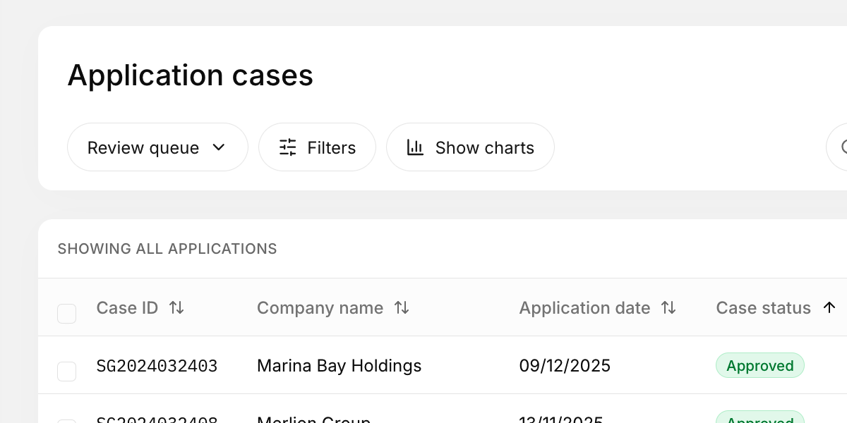
I defined three distinct, task-specific views based on user intent. I implemented a simple "View Switcher" at the top of the table:
- Review Queue: Prioritises processing time remaining, assigned status, and case type (for Reviewers).
- Management Oversight: Prioritises approval status, team load, and overall case velocity (for Managers).
- Compliance Audit: Prioritises risk score, compliance flags, and source channel (for Risk Analysts).
Users can still temporarily toggle columns during their session if needed, but the smart presets solve 95% of their needs immediately, working around the technical limitations without requiring backend storage.
The takeaway
In complex systems, "Flexibility" is often expensive (both for the developers to build and for the users to configure). By curating the data based on user tasks, I achieved a highly personalised experience while respecting the technical constraints. The best interface isn't the one that lets you do everything; it's the one that knows what you want to do.